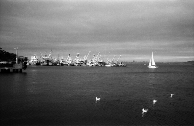
At a heavy cloudy and very bad day, sun showed its face for a moment and below scene just happened. It was a perfect light with a darker background. I dreamed this atmosphere as soon as I saw it. In the darkroom I increased the contrast till the see was placed Zone II (Black areas with detail.) Also I placed the sail at Zone VIII (Textured white) by adjusting the exposure.

Here are the print details:
Paper: Ilfrord Multigrade IV Fiber 1K Glossy
Paper Size: 24x30.5 cm (9.5x12in)
Image Size: 18.5x28.2 cm (7.3x11.1in)
Developer: Dektol 1+2 (2 min.)
Toner: Kodak Rapid Selenium Toner
Film Format: 35 mm
Also you can see the standard print preference at the below:
Which one do you prefer? :)
hi!
ReplyDeletenice work!
i prefer the second one :)
the first one is also good, but a little bit to dark to my taste.
great blog, keep it up!
Great impact with the darker version. The second version doesn't carry the same sense of doom.
ReplyDeleteYour blog is great, btw. Impressive work!